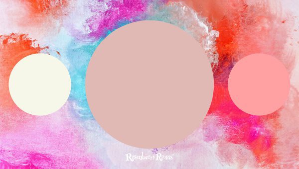
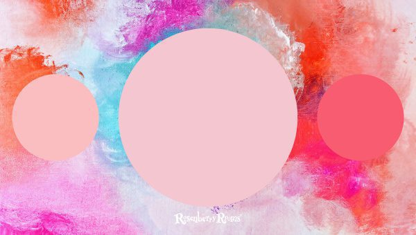
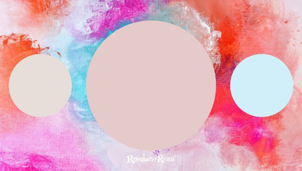
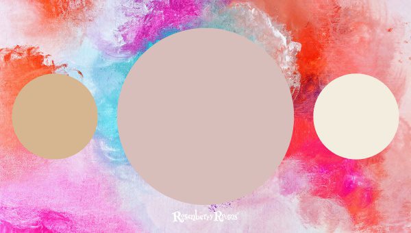
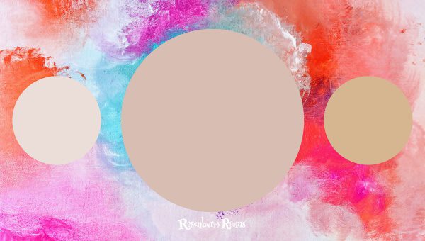
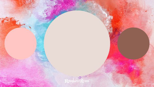
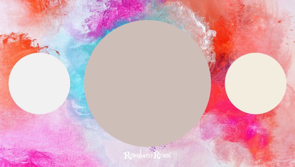
I’ve always been drawn to blush paint colors. There’s something about the gentle, warm hue that can instantly brighten a room and add a touch of elegance to any interior design.
It’s subtle yet striking, sophisticated but also playful. Over the years, I've seen how these fantastic colors can transform spaces like nothing else can.
Yet many people seem too intimidated or unsure to implement this unique color scheme in their own homes.
I'm here to help you navigate the vast world of blush paint colors and hopefully inspire you to breathe new life into your home with them.
While blush might initially make you think of delicate femininity, we must break free from those boundaries. Blush paint colors are so versatile that they appeal to any style and gender.
Whether in an urban loft, a rustic farmhouse, or a modern minimalist apartment – Blush gives interiors an unmatched glow that photographs beautifully under natural light and makes you feel like your home is straight out of a magazine spread! Stick around as we delve deeper into how spectacularly blush can redefine your living space.
What are Blush Paint Colors?
Blush paint colors, referred to as 'adult pink,' have become a famous home decorating choice. Let’s brush some strokes of details:
- Think of blush as a mature, sophisticated version of pink. It brings an unexpected warmth and tranquility that exudes romance and sophistication.
- They are soft pastel shades between pink and peach — but not too sugary or intense.
- Most blush colors are muted, often with hints of beige, taupe, or grey mixed in. These undertones make them more flexible to combine with other colors.
- What distinguishes blush colors is their subtlety — don’t expect any bright, vibrant shades here! Instead, they are soft and toned down, exuding quiet charm.
- Like all colors, blush has various shades and tones. Some are nearly nude, while others lean toward dusty rose or soft salmon.
Through their versatility and elegance, blush paints inject an inviting aura with unmatched tenderness into your interior space. Whether for a feature wall or an entire room, these hues bring fresh air to your home aesthetics.
Where to Use Blush Paint Colors
Blush paint colors have a transformative effect on spaces, invoking warmth, harmony, and stylish elegance. Here are some of the best places to apply blush paint colors:
Living Room
The living room is often the central hub of a house — a space for relaxation and coming together. A blush paint color can help create a calm, welcoming environment perfect for lounging or hosting guests.
- Bold Statement Piece: Consider using blush on a feature wall or alcove for an understated yet impactful design. This could be the wall that houses your fireplace or even your favorite piece of art.
- Subtle Touch: If you're not ready to go all in with blush walls, consider using it subtly with accessories or accent furniture.
Bedroom
The bedroom is our private sanctuary meant for relaxation and rejuvenation. The soft ambiance introduced by blush hues makes it ideal for bedrooms.
- Go All Out: There's no better place to embrace the softness of blush than in your bedroom walls. The calming vibes help to create a serene sleep environment.
- Accent: Try painting an accent wall behind the bed to anchor the room visually, leaving other walls neutral.
Bathroom
You might not immediately think of bathrooms when considering where to use blush paint colors, but they can also make quite a statement here.
- Unexpected Yet Chic: Blush gives your bathroom an elegant sophistication that feels unexpected yet chic.
- Tile Accent Colors: If remodeling is on your mind, choose tiles with hints of blush combined with neutrals like white or grey for a modern effect.
Dining Room
Something is soothing about eating amidst rosy surroundings that inspire lively conversations at communal meals.
- Warm Walls: Painting the walls with a hot, blush shade could make dining a memorable experience.
- Accent Cabinet: If full-blown pink walls seem too much, consider giving your cabinet or credenza a fresh blush hue.
Home Office
In this era when work-from-home has become a regular practice, creating an inspiring workspace at home is crucial.
Using blush colors in your home office is an excellent way to balance focus and inspiration and evoke positive emotions as you work.
- Motivating Mural: A mural wall in various shades of blush can foster creativity and ensure you stay motivated during working hours.
- Timeless Bookcase Backdrop: An innovative idea would be painting the inside of your bookcase or shelves in broad strokes of blush - turning books and décor into instant eye-catchers against its backdrop!
Remember that it’s not just about adding color but also how these colors interact with elements like lighting, furniture, and textiles within these rooms – each capable of transforming their space into a magnificent setting!
With Blush Pink Paint Colors redefining interior paradigms - it invites refreshing change while radiating timeless charm.
Why is the Sample Essential Before the Whole Paint?
Before committing to a specific blush paint color for your rooms, taking a sample home and testing it out is crucial. Sampling paint colors before the big paint job has undeniable advantages:
- Visualizing: Sampling allows you to see how the selected color interacts with your room’s existing elements, like natural light, furniture, textures, and other wall colors.
- Determining Underlying Tones: Every blush paint has unique undertones. A sample helps pinpoint that undertone in various lighting conditions to ensure it complements your decor scheme.
- Saving Time and Money: Let’s face it; paint can be expensive. Testing a small sample beforehand can negate the risk of investing money and effort in an unsuitable shade.
- Gauging Paint Quality: Not all paints are created equal. A sample can unveil essential characteristics like drying time, number of coats needed, and texture —indicating if it’s the right pick for you.
Further clarity about the importance of samples can also be obtained.
You plan on living with this color for a while — henceforth, testing out some samples is justified, even if it adds an extra step to your painting project. As they say, better safe than sorry!
20 Best Blush Paint Colors
Choosing the right blush color for your space can be overwhelming, given the multiple options available. Numerous shades may look like duplicates to an untrained eye, but each comes with subtle differences that significantly impact the mood and aesthetic of a room.
Here are my top picks for blush paint colors, gleaned from hours spent comparing paint swatches and considering undertones:
1. Benjamin Moore Pink Cloud 887
Benjamin Moore Pink Cloud 887 is a classic blush color in every sense. It brings a timeless charm that transforms any room into a picturesque interior haven.
This color balances innocence and warmth, two crucial factors in creating a welcoming atmosphere.
- Texture: "Pink Cloud" boasts a velvety smooth finish that is visually and physically pleasing.
- Undertone: This hue loosely sits between pink and peach without leaning too much towards either side, which enables it to blend seamlessly with various styles and neighborhood ps.
- Versatility: It works wonders on walls and furniture pieces, instantly making them stand out without being overly loud.
- Mood: By lending itself to light beautifully yet subtly, Pink Cloud helps create an uplifting aura in whatever space it graces.
2. Benjamin Moore Blushing Bride 2086-50
Next up is Benjamin Moore's Blushing Bride 2086-50. This color incorporates rosy accents into its undertone, providing enough sophistication to make your rooms stand out effortlessly.
- Texture: Blushing Bride has this smooth satin finish which lends an element of polish to any wall it adorns.
- Undertone: With warm undertones evocative of rosy cheeks or cherry blossoms in springtime bloom, this shade is mildly flirtatious and elegant enough for formal settings.
- Versatility: Given its universal appeal and subtlety, it can comfortably fit into many design schemes, whether traditional or contemporary. This adds to its popularity among homeowners and architects.
- MoodIf you're looking to instill calmness while maintaining visual interest throughout your space, I doubt there'd be many better choices than Benjamin Moore's blushing bride.
As you go through this list of top-notch blush colors, remember that their impact largely depends on how they are used alongside other colors (pairings), what sort of light they're exposed to, and the area (how big/small the painted surface is). Choose one that syncs up with your style and watch your ambiance get 'blushed-up.'
3. Benjamin Moore Sugarcane 1185
If you aim to create a peaceful and heartwarming ambiance in your room, Benjamin Moore Sugarcane 1185 is the color to have on your shortlist.
The genius of this shade lies in its soothing blend between off-white and light blush, producing a charming sophistication that resonates with tranquility.
- Consistency: Sugarcane possesses an ultra-smooth texture that imparts an almost calming essence to any room it graces.
- Versatility: This shade has immense decor adaptability. Its relaxed nature allows it to pair well with both warm and cool hues.
- Tones: Its undertones of subtle pinkish-beige give life without overpowering the simplicity of the base color.
- Mood: There's no denying the cloud-like comfort level Sugarcane provides through its soothing neutrality. It transforms areas into inviting sanctuaries where relaxation is unavoidable.
4. Sherwin Williams Blushing SW 6617
Next, we have Sherwin Williams Blushing SW 6617 - a hue that embodies modern elegance with a feminine touch.
The name gives away its ability to replicate the natural flush of joyous excitement, akin to the bloom on apple trees during spring.
- Finish: This blush hue has a remarkable finish that leans towards a soft matte look rather than a glossy shine, making walls seem stylish.
- Undertone: It imparts warmer neutral undertones, thereby providing depth and complexity often absent in other pastel shades.
- Impact: Sherwin Williams Blushing provides an excellent backdrop for spaces aiming for understated elegance. It complements decors from minimalist to rustic effortlessly.
- Mood Tones: Evoking happy and comfortable moods, this color achieves what every decorator aims for – making every space feel like home!
5. Sherwin Williams Appleblossom SW 0076
Let's shift gears from warm blush tones to something a bit more lively with Sherwin Williams Appleblossom SW 0076. Imagine capturing springtime exuberance all year round within the quiet corners of your residence!
- Vibe: Appleblossom professes jubilance without being overpowering—the perfect middle ground between classic pinks and muted pastels.
- Flexibility: Despite its bolder personality compared to others on this list, Sherwin’s Appleblossom can flawlessly mesh with various design schemes, especially those involving natural materials such as wood or stone.
- Color Pairings Elaborative contrasts are where this hue shines brightest. Pair it with whites or creamy neutrals for the ultimate harmonious balance—or experiment by juxtaposing darker-toned furniture against this cheerful canvas. Understanding light penetration within your space is vital before you decide which blush paint colors suit you best since their effect dramatically varies under natural versus artificial light.
All in all, if you'd like your living quarters or workspace vibrant but not overly bright—a splash of this unique blush can indeed be beneficial.
6. Sherwin Williams Mellow Coral SW 6324
Sherwin Williams Mellow Coral SW 6324 is every bit as charming as it sounds. The color is a unique blend of hues that teeters between fresh pink and juicy peach – offering a refreshing feel that's hard to resist.
If you're seeking a blush tone that walks the delicate line between sophistication and vibrancy, then this might just be your ideal pick.
- Texture: Mellow Coral bears a smooth satin-like finish that fills spaces with inviting warmth.
- Undertone: Noticeably orangey undertone places it on the warmer end of the blush spectrum. This unassuming earthiness makes the shade tremendously versatile.
- Versatility: Being a warm-toned paint, it works best in rooms with lots of natural light. However, don't underestimate its compatibility in dimly lit rooms for an instant mood lift.
- Mood: A pleasing aura is induced by this color, breathing new life into any space. It will appeal particularly to those who favor modern minimalist settings with a cozy twist.
7. Sherwin Williams Intimate White SW 6322
Introducing Sherwin Williams Intimate White SW 6322 — the perfect way to subtly incorporate blush into your home without making too bold of a statement.
- Texture: With subtle sheen on its side, Intimate White offers an almost pearlescent feel once applied to surfaces.
- UndertoneIts undertone subtly lands between pink and beige—just enough flush to add depth without overtaking.
- VersatilityIntimate White serves brilliantly as a backdrop for numerous styles due to its neutrality; from rustic to modern, or eclectic designs.
- MoodThis paint establishes calming tranquility in spaces while maintaining opulence due to its understated grandeur.
8. Benjamin Moore Ballerina Pink 2082-70
We have Benjamin Moore's Ballerina Pink 2082-70—a soft hue evocative of ballet slippers which never fails to add grace and charm with gorgeous complexity hidden behind its subtlety.
- Texture: Great elegance accompanies Ballerina Pink's interplay with light, mainly due to its delicate, luminous finish.
- UndertoneThe creamy undertone oozes femininity while providing enough versatility for both traditional and contemporary settings.
- VersatilityAble to shine independently or compliment other hues—this culminates into very well-placed flexibility for variety in decor pieces and furniture choices.
- MoodThe intimate mood set by this blush color is reminiscent of nostalgia yet keeps you feeling refreshed—a unique balance which proves challenging for many colors out there.
Remember that choosing paint colors involves more than just superficial considerations—it's about understanding a shade’s character intuitively and making sure it aligns with your vision for ambiance cultivation at home.
Blush paint colors are indeed décor chameleons. They go far beyond 'pretty'—they can be chic, serene or complex through versatility unheard of in lesser-known shades.
9. Benjamin Moore Heather Pink 2091-60
Heather Pink by Benjamin Moore is a quiet and soothing blush color, reminiscent of blooming heather fields. This gracefully subtle hue brings a unique type of elegance and tranquility, making it an excellent choice for homeowners seeking to inject some soft charm into their homes.
- Texture: Heather Pink has an intimately smooth finish that adds visual comfort to any wall.
- Undertone: This color has quite a unique undertone—it's not purely pink. Rather it embraces subtle undertones of lilac, bringing in a touch of the unexpected. It pairs well with greys and purples without overwhelming them.
- Versatility: Whether for your minimalist interior or sophisticated classic-style bureau, its mellow tint effortlessly ties together diverse elements leaving your space feeling balanced.
- Mood: Like quietly gazing into a cotton candy sunset, Heather Pink sets the mood for peace and relaxation. There's just enough pink to keep it in the blush family but not enough to make it overtly feminine.
10. Benjamin Moore Pink Parfait 2004-60
Now we arrive at another fabulous creation by Benjamin Moore - Pink Parfait 2004-60. It’s subtle enough not to yell 'PINK' in capital letters but lively enough to set an amicable playful tone in your room.
- Texture: (Pink Parfait) celebrates elegance with a fantastic velvet finish that is ideal for spaces needing some upscale sophistication.
- Undertones: There's barely there coral undertone that gives this pink its festive depth - just perfect for a cozy sitting room or dining area.
- Versatility: Paired up or toned down, this color works brilliantly with neutral tones like creams, tans even greys making styling effortless without losing out on chicness.
- Mood: Resembling sugary confectionery delight dipped in rosy charm - this hue rightly adds flirtatious softness to your space encouraging openness and warmth.
11. Sherwin Williams Innocence SW 6302
Innocence SW 6302 by Sherwin Williams is such underrated magic! They manage to capture simplicity's beauty in this delightful blush shade.
A fantastic option if you're looking for a color serves as only a hint of blush rather than steals the show.
- Texture: Sporting satin sheen finish - Innocence come alive under natural light giving life to your living space walls or accent pieces!
- Undertone: The pleasing light rose undertone touched up with faint traces of beige sets it apart from sugar-coated sweet pinks – offering grown-up sophistication.
- Versatility: Its understated simplicity enhances its ability to complement almost any other color on the palette gracefully without causing visual dramatization!
- Mood: Whispering serenity and soft intimacy - Let Innocence take over as you get washed over by feelings of peaceful hush, setting the mood wherever applied!
It may sound like I’m painting walls while painting pictures with words – but once these hues enter through your doorway – you see that both realities aren't that different! Aren’t we all after beauty expressed uniquely?
12. Benjamin Moore Rose Silk 2104-60
There’s something undeniably attractive about Benjamin Moore's Rose Silk 2104-60. It exudes a serene elegance, straddling the line between traditional femininity and modern sophistication.
This color exhibits class that never goes unnoticed yet has a warm whisper that wraps an entire room in a calming embrace.
- Texture: Rose Silk harbors an exceptional balance of refinement and depth, giving off a soothing satin texture.
- Undertone: It carries subtle cool undertones, tinged with notes of lavender and rose that further enrich its blush personality.
- Versatility: The shade gracefully works its charm in intimate corners and expansive walls, complementing various design preferences.
- Mood: Rose Silk draws one towards itself with effortless grace, subtly illuminating any space it is applied to while fostering tranquility and relaxation.
13. Sherwin Williams Faint Coral SW 6329
The Sherwin Williams Faint Coral SW 6329 is another stellar blush paint color. This shade leans more towards summer evening skies than the conventional pink spectrum we often associate with 'blush.' Its distinct character infuses beauty into any area it graces, making it incredibly special.
- Texture: Sherwin's Faint Coral brims with a silky smooth finish you can't help but notice, drawing attention to walls while giving them an unexpected freshness.
- Undertone: The color sports soft coral undertones that happily dance between pink and peach shades. These warm undertones lift "Faint Coral" from being just another blush paint color to one quite extraordinary.
- Versatility: Its capacity to soak up light beautifully enables this hue to fit fetchingly well into contemporary, minimalist, as well as farmhouse-inspired interiors.
- Mood: There’s a distinctive cheeriness tied to "Faint Coral," brightening up rooms in ways standard blush colors may not necessarily accomplish.
14. Benjamin Moore Pale Cherry Blossom 2101-60
If your goal is achieving an understated luxury without sacrificing comfort, Benjamin Moore’s Pale Cherry Blossom 2101-60 shade could be your ideal match. This color signifies quiet elegance while retaining playfulness that keeps things light-hearted.
- Texture: With its delicate texture reminiscent of organza or tulle fabric draped over couture creations on a runway show — Pale Cherry Blossom affords walls an appealing delicacy unmatched by other colors.
- Undertone: The slight chilliness makes this hue blush apple-cheeked cherry blossoms come alive after a mild rain shower. Each stroke holds such remarkable prettiness; it seems nature lent this shade her soft-yet-vivacious touch!
- Versatility: Given its sophisticated blend of flat-out cheerfulness, with frosty blues/earthy browns/soothing whites, Pale Cherry Blossom’s versatility becomes pretty apparent! It effortlessly dials down busier spaces or cranks up subtler settings!
- Mood: Anyone wishing for romantic softly-lit cottage-style vibes at home should seriously consider this color—it brings such sweet serenity wherever featured!
15. Benjamin Moore Pleasing Pink 2003-70
If there's one blush color that holds a certain allure in the world of interior design, it’s the Benjamin Moore Pleasing Pink 2003-70.
This elegant and subtly stimulating shade has an uncanny ability to express a wide-ranging charm, making it diverse for various settings. Let's delve deeper into what makes this color a top choice for decorators and homeowners alike.
- Texture: Pleasing Pink paints a deeply soothing canvas with its matte-finish texture. This finish brings an inherent purity to the color giving it widespread appeal.
- Undertone: Its undertone is soft yet impactful, neither strongly peach nor heavily lavender. This neutrality makes it versatile, working in harmony with different colors and styles.
- Versatility: From bath walls, bedrooms to living rooms, Pleasing Pink breaks the myth that blush colors are limitedly suited for feminine spaces or specific regions of your home.
- Mood: Its calming effect induces relaxation without sacrificing visual entertainment; it exudes bursts of cheerfulness in a toned-down manner.
- Place: Ideally used for small spaces, this shade can amplify their dimensions instantly.
Remember: the success of any paint job depends on your prep work! Always take sample swatches home and view them in natural light before making your final decision.
16. Sherwin Williams Fading Rose SW 6296
Sherwin Williams Fading Rose is another unmistakable blush paint shade admired by many. Like its name suggests, it embodies the epitome of grace with its muted appearance that mimics a blooming rose fading over time.
- Texture: With the ability to reflect both shadows and highlights beautifully, its satin texture appeals to those who desire depth without glossiness.
- Undertone: The fascinating thing about Fading Rose is its somewhat neutral undertone that provides an old-fashion touch while maintaining a modern appeal.
- Versatility: Applicable on all surfaces including metallic fixtures and fabric-based materials – It doesn’t discriminate!
- Mood: Known for evoking a peaceful ambience associated with country homes or antique-filled libraries.
17. Sherwin Williams Pale Pink SW 9696
The last blush paint color on my list is none other than Sherwin William's Pale Pink SW 9696; true yet understated – evoking innocence with every brush stroke!
- Texture: Devoid of shiny particles or reflective sheen, Pale Pink comes with an authentic matte finish enhancing its quiet sophistication.
- Undertone: Be mesmerized by its creamy blush undertones with modest hints of peach squeezed into the mix, creating a well-rounded palette
- Versatility: Don’t be fooled by its gentleness! Exhibiting charm in expansive living rooms or as statement-making detail spots like doors or dressers – It leaves lasting impressions without overpowering designs!
- Mood: Invoking comfort through unadulterated serenity this shade gently encourages tranquillity throughout your space
From timelessly charming vintage aesthetics to sleek contemporary styles – or somewhere in between - these blush hues can be tailored perfectly within any interior style creating experiences you'd love coming back to!
18. Sherwin Williams Pink Shadow SW 0070
Sherwin Williams Pink Shadow SW 0070 is almost a whisper of blush that brings in a breath of freshness. Its understated elegance makes it the perfect selection to create a breezy, calming ambiance within your interiors.
Without being overly feminine or childish, this flushed paint color exudes a tender warmth and sophistication.
- Texture: Pink Shadow has a light, airy texture which lends itself quite well to living rooms and bedrooms where tranquility is paramount.
- Undertone: It falls more on the neutral side, making it incredibly versatile in matching with various styles and color palettes.
- Versatility: From feature walls to accent pieces, there are virtually no limits on where you can incorporate this sweet blush shade. Due to its subtlety, it's particularly good for spaces that captivate natural light.
- Mood: If you're yearning for an uplifting yet soothing aura in your space, Sherwin Williams Pink Shadow is exactly what you need.
19. Benjamin Moore First Light 2120-70
Indulge in the subtle charm of the Benjamin Moore First Light 2120-70—a soft rosy hue with quietly glowing undertones which catches early morning's first light beautifully on your walls.
- Texture: This blush color achieves an effortlessly smooth finish that adds an extra layer of finesse.
- Undertone: Warm but not overtly so - 'First Light' quite literally captures the early morning pink sky tones within its folds - balancing between warm and cool quite magnificently.
- Versatility: An ideal choice for large spaces needing a touch of warmth - from drawing rooms to bedroom ceilings and even kitchen cabinets – this blush marvel finds itself at home anywhere!
- Mood: The mild airiness emanating from this color truly makes your space feel open, inviting and energized.
20. Benjamin Moore Gobi Desert 2110-50
Immerse yourself in the elegance of Benjamin Moore Gobi Desert 2110 – a mature take on blush that gives rooms both depth and sophistication.
- Texture: Gobi Desert has an earthy texture remarkably similar to its namesake – adding substance wherever applied.
- Undertone: This one hovers at the boundary between beige-pink with just tiny nods towards purple - making it one unique addition for any dwelling styled after elegant minimalism.
- Versatility: 'Gobi Desert Blush' works across various blends - modern contemporary or classic traditional interiors equally befriend this gem!
- Mood: It brings substantial serenity alongside adding warmth into living spaces or bedrooms.
What sets apart these top-tier blush colors is how remarkably they pair versatility with uniqueness while managing not just to survive but thrive under varying lighting conditions.
Your choice among them should essentially be guided by how well they sync up with overall interior aesthetics while giving your intended ambiance just enough ‘blush’!
FAQs About Blush Paint Colors
What are blush paint colors?
Blush paint colors are a sophisticated version of pink. They’re soft pastel hues, usually with beige or gray undertones, that offer a muted yet graceful charm.
Where can I use blush paint colors in my home?
You can incorporate blush paint colors in any room - from living rooms and bedrooms to bathrooms, dining rooms & home offices; their subtle charm makes any space feel calmer and warmer.
Can I choose blush for a feature wall?
Absolutely! A blush-colored feature wall can serve as an elegant focal point that introduces warmth without overwhelming the space.
How do I choose from different blush shades?
It's essential to consider the light source in your room and the mood you want to create before choosing the appropriate blush shade. Sampling is also key!
Why is sample important before finalizing a blush color?
Sampling is crucial because colors can appear differently on your walls compared to a color chart. By sampling, you ensure the chosen hue matches your vision perfectly under natural light.
Conclusion
Blush paint colors are a game-changer. These muted, sophisticated hues bring a sense of calmness and elegance to any room, making them an excellent choice for people looking to spruce up their living spaces without going overboard. With blush becoming increasingly popular, it's not surprising that there's a wide array of shades to choose from.
In choosing the perfect blush for your home, remember it’s not just about following trends but selecting the hue that resonates with your personality and aligns with your home aesthetics.
Don’t shy away from samples before deciding because colors can drastically change depending on lighting and surrounding elements.
Trust your instincts, consider the mood you intend to create, play around with samples, and let the world of blush unfold its magic in your abode.

