As an interior design enthusiast who values the impact of colors, discovering Agreeable Gray SW 7029 wholly transformed my perspective on neutrals.
For ages, I've encountered countless shades of grey, each with its charm. Yet none provided that perfect balance of warmth and elegance I crave until I stumbled upon Agreeable Gray SW 7029. Talk about a game-changer.
I know what you're thinking- it's just grey. But let me tell you, this shade is so much more than just another drab color on the wall.
Agreeable Gray has it all wrapped up regarding versatility in design and the ability to create a serene atmosphere without being overbearing or dull. Let's delve deeper into why this shade is more than agreeable; it's irresistible.
Contents
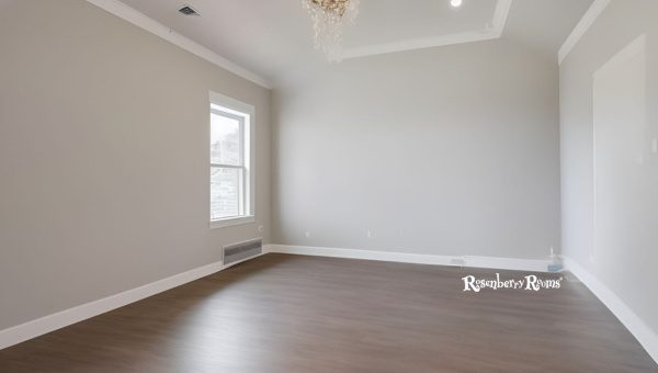
There's something monumental about finding a color that instantaneously adds beauty, charisma, and sophistication to any space.
Agreeable Gray SW 7029 has all of these captivating qualities and more. Part of its allure comes from the undeniable charm distinguishing it from your dull gray shades.
So, what is it about this lovely shade that's so captivating? Here are a few key points:
Delving deeper into this exquisite shade's alluring qualities, you can't overlook the harmony of warmth and sophistication this beautiful color achieves.
In terms of versatility, Agreeable Gray trumps most other grays. How so? Well, let me entertain you with some fine examples:
With strands intricately woven between neutral tones reminiscent of comforting warmth and formal sophistication, Agreeable Gray SW 7029 stands true to its name - it simply agrees.
It imbues your spaces with grace while ensuring the journey to achieving an 'agreeably' stunning home is equally pleasing.
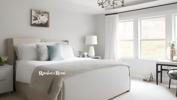
Well, I find it intriguing how some shades win the hearts of homeowners and interior designers alike, and Agreeable Gray SW 7029 has done just that.
It’s a favorite choice for many, given its capacity to seamlessly blend with almost any interior décor, whether contemporary or vintage.
This color adapts well to various zones in your home. Whether it's the living room, the heart of your home where you cuddle up with a good book or enjoy family time, or the sanctuary that is your bedroom, this shade has got you covered.
Agreeable Gray has this fantastic charm to enhance natural light. Its high Light Reflective Value (LRV), which sits comfortably at 60, makes a room feel larger and airier. Coupled with its humble presence, this makes it an ideal choice for smaller spaces.
It's no secret that gray can sometimes cast cool shadows in certain lighting conditions. But Agreeable Gray hasn't earned its reputation by being any old gray – no sir!
This shade exhibits balmy undertones of green, blue, and purple, which can add a subtle, sophisticated character to your favorite spaces.
The beauty of Agreeable Gray lies in its ability to pair well with other colors! It is an excellent backdrop for bold accents such as navy blues or rich burgundies.
And there you have it, folks! A versatile home runner like Agreeable Gray isn't famous without reason!
You may be wondering what the term "LRV" stands for. Well, this is simply an acronym for Light Reflectance Value, a significant factor in the world of paint and color!
Getting familiar with this concept will be helpful if you want to introduce Agreeable Gray SW 7029 into your living or workspace.
In essence, Light Reflectance Value (or LRV) measures the percentage of light that a given paint color reflects. Sounds technical? Allow me to simplify it.
LRV readings range from 0% (absolute black absorbs all light) to 100% (pure white reflecting all morning). According to the paint gurus at Sherwin Williams, Agreeable Gray boasts of an impressive LRV of 60%. With such a reasonably high rating, it falls near the halfway mark on the LRV scale.
This means that Agreeable Gray falls under the 'medium' category for light reflectivity- not too dark or bright.
Just right! With such a balanced LRV, it's no wonder that Agreeable Gray has become my newfound favorite neutral!
When you incorporate Agreeable Gray SW 7029 into your space, its balanced LRV provides a room with a cozy but not overpowering sense of warmth. A room painted this color won't feel overly bright during the day or oppressively dark at night - making it an excellent all-rounder.
So whether you're looking to paint just an accent wall or deciding on a whole-room makeover, understanding LRV will go a long way in helping you make your decision and understand why Agreeable Gray might be your ideal choice!
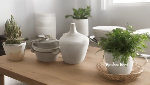
Getting to the heart of Agreeable Gray requires a look at its subtle undertones. Like every color, it has those sneaky hidden hues that only become apparent under certain light conditions or next to other shades. The key is deciphering what Agreeable Gray holds beneath its austere facade.
Unlike many grays that may appear too cold due to blue undertones or excessively warm when pulling beiges and tans, the charm of Agreeable Gray lies in its agreeability.
When painted on your wall, it's typical to notice soft green and bluish undertones occasionally. Let's trace what this makes.
| Light Conditions | Emergent Undertone |
|---|---|
| Bright Sunlit Spaces | Hint of Blue |
| Soft Ambient Spaces | Slight Green |
Don't worry! These are not jarring but add that extra character keeping the space from feeling sterile.
Check out SW’s color page for yourself and see how they recommend pairing it up with other harmonious hues as per your ambient situation.
Undoubtedly, the power is in the passion with which you or your designer choose to express this shade’s myriad facets in your setting.
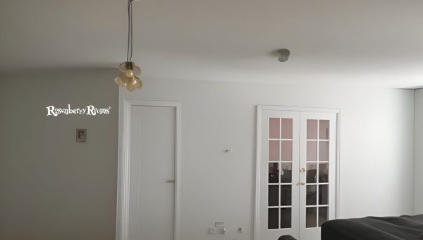
Finding the perfect shade of gray for every room can be a real challenge. But not all grays are created equal, so we're talking about the superstar - Agreeable Gray SW 7029.
It's more than just a beautiful shade; it's about the versatility and universal appeal of this color, making it fit seamlessly into almost any room in your home.
Indulge in the warm, welcoming ambiance that Agreeable Gray SW 7029 brings to your living room. This exquisite shade delivers an inviting atmosphere and presents a perfect modern canvas for your personal touches.
Agreeable Gray adapts effortlessly if you have a small insulated family room or a grand salon connected to an open plan.
Our day begins and ends in the bedroom, demanding a peaceful yet invigorating surrounding. Painted with Agreeable Gray SW 7029, it becomes the soothing sanctuary of your dreams.
It's as versatile in bedrooms as anywhere else - complementing either dark mahogany furniture or light oak/wheat-tinted fittings equally well.
Your kitchen deserves to have personality while exuding cleanliness and warmth. Here is where Agreeable Gray SW 7029 steals the show!
Its taupe-y undertones mix perfectly with stainless steel appliances while shadowing beautifully under those walnut cabinets.
With Agreeable Gray SW 7029, you're not just painting your walls; you're curating an aesthetic milieu that seamlessly combines modernity and comfort! Standing at this delightful crossroads of gray, beige, and taupe – there’s no going wrong – promise!
Imagine beginning your day in a peaceful, welcoming space. A bathroom painted with Agreeable Gray SW 7029 can deliver that experience.
This balanced, neutral hue offers warmth and comfort, creating a relaxing and rejuvenating atmosphere. Bathrooms often lack natural light, but the luminous quality of Agreeable Gray transforms these spaces.
It pairs well with white fixtures and marble surfaces, resulting in a sleek yet charming aesthetic.
Your dining room is where meals turn into memories. With Agreeable Gray SW 7029, you can set a comfortable backdrop for memorable feasts and cherished conversations.
This versatile hue harmonizes well with various wood tones in dining room furniture. Agreeable Gray adapts beautifully whether your style leans towards antique charm or urban chic.
Creating a serene yet productivity-inducing workspace is critical when designing your home office. Painting it with Agreeable Gray SW 7029 is an excellent choice due to its calming undertones that reduce stress without inducing sleepiness.
It coordinates effortlessly with dark wood desks and contemporary metal-and-glass furniture pieces.
The hallway is more than just a corridor connecting different rooms; it's an opportunity to create transition spaces that are inviting yet captivating.
Agreeable Gray SW 7029, being a neutral hue, works seamlessly along hallways without conflicting with other colors.
Moreover, despite being classified as gray, this shade has earthy undertones that radiate warmth into hallways – whatever length they might be!
Oh, baby! For parents-to-be looking forward to decorating their little one's nursery but wishing to stray from conventional pink/blue alternatives - guess what?
Agreeable Gray SW 7029 can work wonders! It's soft without being insipid, contemporary while still being timeless - essentially perfect!
And since it's neither too masculine nor too feminine – regardless of whether you have a boy/girl/surprise - this shade suits all!
Why settle for satisfactory when you can have agreeably gray-satisfactory interiors instead? Embrace Agreeable Gray SW 7029 – because painting happiness couldn’t become more accessible!
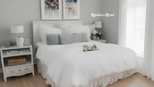
I fell in love with Agreeable Gray SW 7029 primarily because of its incredible versatility. Its intriguing nature allows it to blend seamlessly in interiors; regardless of the design type—modern, contemporary, rustic, mid-century—you name it, this color pulls it off effortlessly.
What truly caught my eye was the transformative power this shade possesses. The color subtly shifts throughout the day and night in response to natural light and space changes, owning up to its chameleon-like reputation.
One moment it may flow as a warm undertone space; the next, it leans towards a much fresher and slightly cooler hue.
Styled correctly, Agreeable Gray shines brighter when paired harmoniously with other colors. Here's a simple chart that shows some of the best colors that complement Agreeable Gray SW 7029:
| Complimentary Colors | Explanation |
|---|---|
| Pure White (SW 7005) | Perfect for trims and mouldings |
| Sea Salt (SW 6204) | Creates a warm beachy vibe |
| Coral Rose (SW 9004) | Adds a pop of color to contrast |
| Naval (SW 6244) | Amplifies sophistication with deep blue |
Remember that nothing about interior design is ever 'one-size fits all.' Experimenting and mixing these suggested pairs will bring unexpected yet delightful results.
Agreeable Gray is unique because this shade is undeniably accommodating, unlike most hues that grow darker in smaller spaces or fade away in larger rooms.
Smaller rooms don't feel claustrophobic thanks to their high light reflection value (LRV), while larger rooms bask in generous amounts of soft, relaxed elegance.
In the bland and often boring neutrals world, Agreeable Gray stands out remarkably for its chance at changing personalities according to space sizes while not compromising style—a perfect partner for hallways moving onto bigger living rooms or kitchens flowing into cozy nooks.
No matter which corner of your house you’re trying to spruce up, whether it’s your bedroom or home office, or nursery—Agreeable Gray SW 7029 adapts beautifully, making every space agreeably yours!
When you've picked Agreeable Gray SW 7029 as your base color, it's time to accessorize. This is where you can infuse your style into the space. However, this versatile gray melds particularly well with specific accessories and decor elements.
Opt for furniture in earthy tones like beige, cream, or soft wood shades to create a harmonious layout. An accent chair in a deep shade, such as navy blue or emerald green, could add a striking contrast too.
Bold patterns look great against Agreeable Gray. Don't shy away from vibrant prints, Whether in your throws, upholstery, or curtains.
Agreeable Gray compliments metallic colors exquisitely. A few gold ornaments here and a dash of silver mirror frames there could elevate the overall aesthetic effortlessly.
Make sure to choose arts that feature colors from the same family as Agreeable Gray – think taupe, off-white, or even black for a more dramatic touch.
Remember that accessorizing is all about balance – make sure nothing overshadows your elegant neutral walls.
When it comes to opting for Agreeable Gray SW 7029, there are certainly both pros and cons. Let's take a closer look.
Using Agreeable Gray empowers you to create sophisticated spaces without sweating over whether or not it will fit into your existing décor choices.
However, it's crucial to consider how light impacts this hue and consider how unique you want your interior palette to be before taking the plunge.
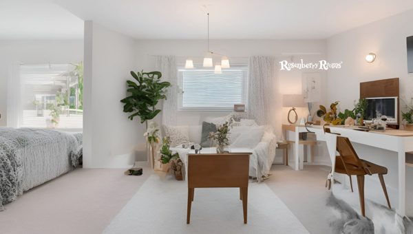
When it comes to deciding on an ideal color scheme, Agreeable Gray SW 7029 stands a head above the rest. It brings a myriad of captivating benefits that are hard to resist on your walls.
One of the foremost benefits is its versatility. Whether it's traditional or contemporary, rustic or industrial, this shade can fit seamlessly into any style and elevate its charm effortlessly.
You rarely come across a shade flexible enough to transform and yet retain uniqueness.
Secondly, it has an amazing ability to brighten up spaces. With an LRV (Light Reflectance Value) of 60, Agreeable Gray is adept at reflecting light rather than absorbing it, making your rooms seem more spacious and interactive.
Also notable is how this soft color adds extra depth to space, therefore serving as an excellent choice for smaller rooms or those without plenty of natural light.
But as with everything in life, there are a few things you should take into account. For instance, due to its relatively high LRV and intricate undertones, Agreeable Gray might feel differently depending on the lighting in your room.
In spaces with an abundance of natural light flooding in, the color can seem lighter and warmer. However, under artificial lighting like incandescent lights or cooler LED lights, Agreeable Gray might take on different hue importance compared side by side.
A crucial factor here is that it plays well with almost all color schemes but you'd want to stay cautious about pairing it with anything too colorful or overpowering so as not out to shadow the subtle elegance of this precious gray.
Choosing Agreeable Gray SW 7029 for your home means choosing elegance without being overpowering; simplicity without being dull; versatility without relinquishing identity - No small thing when creating a space that speaks volumes about who you are and what you love.
Agreeable Gray has subtle undertones of green, blue, and purple that help balance the overall hue and keep it warm yet fresh.
Absolutely! Its neutral temperament allows it to blend harmoniously with a wide range of colors from soft pastels to bold hues.
Being incredibly versatile, this color complements almost all spaces be it your living room, bedroom or even kitchen!
Yes! The light reflectance value of Agreeable gray is high enough to aid in making small rooms appear larger.
You can go with either minimalist or eclectic decors. This shade simply enhances the beauty of any style from modern contemporary to rustic farmhouse.
Agreeable Gray SW 7029 is a unique shade that brings a magical touch to every space it adorns. Its winning combination of warmth and sophistication adds depth and character to your rooms without overshadowing the other elements.
By choosing Agreeable Gray, you are not just opting for a color, but embracing a lifestyle that values simplicity, flexibility, and timeless elegance.
With its ability to seamlessly adapt to varying light conditions and an impressive range of décor styles while maintaining its charming allure, it's little wonder why this hue remains a popular choice among interior design enthusiasts.
So whether you're planning to refresh your current home or looking for the perfect palette for your new house - give Agreeable Gray SW 7029 a shot.