If you've ever considered dabbling in home decoration or sprucing up your living space with a fresh coat of paint, one look at the beautiful Benjamin Moore Moonshine will have you sold.
With an endless sea of colors out there, choosing the best one for your walls can seem like an overwhelming task. But fear not! We've got you covered with our Benjamin Moore Moonshine 2148-60 Color Review.
The Moonshine color, soft and sleek, provides a timeless, understated elegance. Perfect for modern and traditional homes, it harmonizes every corner of your space.
If subtle sophistication is what you aim for, this blog post will be extremely beneficial in making your final decision. Let's find out why this particular shade has captivated many homeowners’ hearts across the globe.
Contents

Moonshine by Benjamin Moore (2148-60) is a part of their off-white collection – a curated selection deeply loved for its incredible versatility and charm.
This color has a Light Reflectance Value (LRV) of 66.53, indicating a light gray shade that can brighten any space.
Benjamin Moore classifies it as an off-white, falling in their gray and green hue family. Interestingly, its subtle green undertone separates Moonshine from other grays, making it more endearing.
This gives the paint a slightly cooler appearance, yet it remains soft and neutral enough to suit varying color palettes.
Explore More: Benjamin Moore Kendall Charcoal HC-166 [Paint Color Review]
Moonshine, with the color code 2148-60, is a popular pick from the Benjamin Moore palette. It sits high among decorators and homeowners for being one of Benjamin Moore's best off-white paint colors.
With a calm and neutral tone that introduces elegance without overwhelming the space, Moonshine has versatility up its sleeve. It can blend beautifully with various settings, design types, and architectural styles, from modern to traditional.
This paint color also has an admirable ability to change in intensity depending on how much natural light it receives - making it all the more coveted and unique.

Moonshine, a wonderfully mellow color, brings its magic to painting projects. The color's versatility allows it to merge seamlessly with any design goals you might have, whether it's a cozy bedroom, a modern kitchen, or a light-filled living area.
The following characteristics are vital to understanding why this shade has remained such a preferred choice for many homeowners:
The Light Reflectance Value (LRV) refers to the proportion of visible and usable light reflected by a painted surface compared to a purely white surface.
The LRV for Benjamin Moore’s Moonshine stands at 66.53 out of 100— showcasing that it reflects significant amounts of light. Its high LRV gives Moonshine an airy and uplifting quality that can make your space feel larger, brighter, and more inviting.
Regarding the undertones observed in Moonshines' spectrum, this hue has very minimal undertones of green and gray. Its slightly green undertone sets it apart from typical grays, which lends a soft, welcoming vibe rather than a stark coldness.
Little marvels add up to make a bigger difference - the gentle softness rendered by its green undertone makes Moonshine an ideal choice to tie together modern and traditional decor themes.
A noteworthy characteristic is how the color transforms under different lighting conditions - showing varying levels of gray and green.
Stay mindful about factoring in these distinct features during your planning phase while choosing soft furnishings or other paint colors for your space.
These nuances will determine how well your selected shade compliments or contrasts with the overarching aesthetic you aspire to bring into your home.
Versatility is the name of the game with Benjamin Moore's Moonshine. This color's understated charm and transitional quality make it an excellent candidate for the interior design of any home, especially for those seeking a balance between modern and traditional.
Moonshine works fantastic in rooms that crave warmth and brightness. Living rooms, bedrooms, and kitchens can benefit greatly from the tranquility of this color.
Due to its high LRV, it will beautifully reflect more light in rooms with ample natural lighting, rendering a brighter atmosphere.
Small spaces such as hallways or utility rooms can truly open up with Moonshine on their walls; its airy feeling and brightening effect make the space seem larger than it is.
The beauty of painting your walls with Moonshine is that it gives you a blank canvas to express your personality through furniture and accessories.
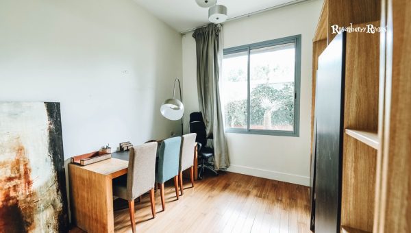
Pulling together a look is effortless; it harmonizes with bold color furniture shades and lighter-toned furnishings. Dark hardwood floors or wooden furniture contrast beautifully against the neutral backdrop of Moonshine.
Adding pops of colors through accessories like throw pillows, rugs, and artwork can also bring an exciting dynamic to your living space. Cool metals like silver or chrome provide an extra dash of elegance when paired with Moonshine.

Moonshine is primarily categorized as a cool paint color. While some grays can lean toward a warmer census, this particular Benjamin Moore gray carries distinct cool undertones you'll note upon application. However, what makes Moonshine so appealing is its versatility.
Despite being fundamentally cool-toned, its green undertone expertly balances the color, presenting a slightly warm aura under certain lighting conditions.
Paying attention to this aspect allows you better to coordinate Moonshine with other colors in your room and helps prevent pairing it with clashes in its "temperature".
Always remember the fundamental rule for interior design: soft and harmonious color transitions are key to a visually unified space.
Sampling is a critical step in your color-selection journey, and here's why: paint cans can be deceiving! Don't fall prey to the little square images on paint cans – they present only a fraction of the color's performance under various lighting and surrounding conditions.
Painting a small swatch is the most effective way to visualize how a shade would look on your walls. Try Benjamin Moore’s pint-size sample containers for an affordable solution.
This lets you observe how Moonshine interacts with your room's lighting conditions and other elements, revealing its true personality.
Direct daylight and artificial light can alter how colors are present. Morning sunlight may bring out more green undertones, while evening light might emphasize its cool gray tones.
Also Read About Benjamin Moore London Fog 1541 [Paint Color Review]

Exterior paint choices are crucial indicators of the vibe your home emits to the external world. If you are considering Moonshine for your exterior, you have made an excellent choice.
This understated color imparts a sense of calmness and serenity, making it a fantastic selection for exteriors.
The beauty of Benjamin Moore's Moonshine lies in its adaptability. It transitions seamlessly from interiors to exteriors, maintaining its refined elegance throughout.
The power of Moonshine lies in how easily it coordinates with other exterior elements:
These insights have given you a clearer perspective on why Benjamin Moore’s Moonshine 2148-60 could be just what your home’s exterior needs.
As versatile as it is, Moonshine begs to be complimented by an equally attractive trim color. The key here is to choose a trim color that will not only frame the walls well but also provide an optimal contrast against the beautiful backdrop of Moonshine.
Consider using a crisp white trim to maximize the beauty of your moonshine-painted walls. Two of our favorite picks are Sherwin Williams High Reflective White SW 7757 and Benjamin Moore Chantilly Lace OC-65.
These shades promise an attractive, clean edge to the cool and calm aura of Moonshine, lifting the neutrality with a touch of brightness without being too overpowering.
Sherwin Williams High Reflective White is pure brilliance in a can. Its high reflectivity enhances light's influence in your space and complements well with the green-gray undertones of Moonshine.

If you fancy exploring alternatives to Moonshine, you have several similar shades that could be a fabulous fit for your spaces.
Regardless of the differences in undertones and hues, these two Sherwin-Williams shades offer sophistication and tranquility that resemble our focus color - Moonshine.
When picking from these shades or Benjamin Moore Moonshine, always get a sample first. Paint swatches on your walls and observe how each shade interacts with light throughout the day. Worry not! There's room for changes and readjustments until you find that perfect tone.
Read More: Benjamin Moore Metropolis CC-546 [Paint Color Review]
Moonshine is exceedingly flexible and can easily match various styles and settings, whether traditional, minimal, or modern.
Though fundamentally a cool color, Moonshine's green undertone beautifully balances the tone, pairing well with warm, cool-themed decors.
Moonshine adapts charmingly under different lighting conditions, showing varying levels of gray and green.
Moonshine pairs effectively with soft neutrals and contrasting dark shades. Combining it with blues, greens, or even washed lavenders could offer exquisite results.
With its high light reflectance value (LRV), Moonshine brings an airy, light-filled atmosphere that feels inviting and spacious atmosphere.
Benjamin Moore’s Moonshine presents an exceptional choice for home enthusiasts seeking to unify their decor with a timeless and versatile color.
Whether you're looking to capture understated elegance or instill a sense of tranquility within your abode, this quietly captivating hue can be your perfect ally.
Its impressive adaptability across different light conditions and superb ability to compliment various decor styles make it a worthy candidate.
So why not make a bold decorating choice this year by bringing in Moonshine—the gray that offers much more than an essential shade?