Grey - the shade that balances between dark and light. The color embodies modern elegance and timelessness simultaneously.
It's no secret that, recently, grey has emerged as the go-to shade for many interior enthusiasts and design experts.
Today, I want to delve into one of those shades that genuinely stands out among the grey paints available – Sherwin Williams Comfort Gray 6205.
In this comprehensive review of Sherwin Williams Comfort Gray 6205, I will share insights about its undertones, ideal lighting conditions, recommended spaces for usage, and how it compares to similar colors.
Whether you have been considering a color makeover or looking for inspiration to spruce up your space with a hint of sophistication, this in-depth discussion could be precisely what you need to guide your decision-making process.
By the end, you'll understand why this shade makes waves in the design world like never before.
Contents
Sherwin Williams Comfort Gray 6205 is from the green color family. It sports location number 217-C2, showcasing the elegance and tranquility of its green roots.
The hex value #BEC3BB reveals an appealing blend of beautiful hues resulting in a refreshing, light color with distinct character.
Comfort Gray also claims a spot in two distinguished color collections: Living Well (Recharge) and Pottery Barn Kids (Fall/Winter). These collections are widely praised for their balanced and inspiring palettes that add depth to any space.
The RGB values of this color are 190 for Red, 195 for Green, and 187 for Blue, constituting a harmonious balance.
What's more, Comfort Gray is versatile enough to be suitable for both interior and exterior spaces. Whether adorning your living room walls or enhancing your home's exterior facade, this charming hue could be an excellent choice.
What makes Sherwin-Williams Comfort Gray 6205 exciting is its Light Reflective Value (LRV), which stands at 54. For those unfamiliar with the term, LRV is a measure of how much light a color reflects.
A value like 54 reflects over half the light that hits its surface - perfect if you're looking to enhance natural lighting in your space!
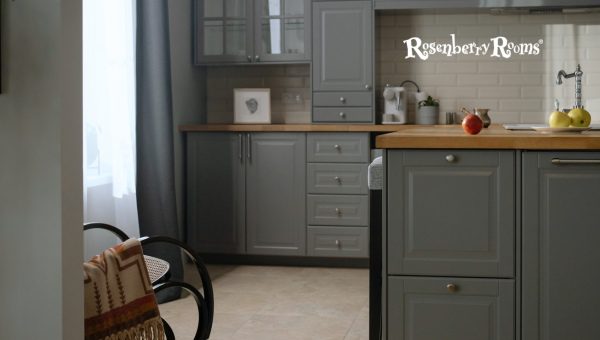
To the untrained eye, pinning the exact hue of Sherwin Williams' Comfort Gray 6205 might seem challenging. Some see green, while others claim it leans more toward blue.
When observed under different lighting conditions and against different backgrounds, you may notice that Comfort Gray sometimes projects subtle hints of both colors. Comfort Gray beautifully straddles the boundary between a greenish-grey and a bluish-grey.
It is important to note that although Comfort Gray belongs officially to the green color family, its versatility allows elements of both blue and green to peek through at times. This complex characteristic makes it alluringly unpredictable, adding charm to this unique shade.
Explore More: Sherwin Williams Moderate White 6140 [Color Review 2025]
Sherwin Williams Comfort Gray 6205 is versatile, adding an aesthetic appeal to both interiors and exteriors.
It has an understated sophistication that resonates with different architectural styles and settings. However, its usage primarily depends on the design intent and the aesthetic you aim to achieve.
Comfort Gray 6205 has emerged as a favorite choice for many interior spaces. Its balanced light reflectivity makes rooms feel more spacious and welcoming. It has a way of injecting calmness and sophistication, creating perfect harmony within your home.
For spaces like the living room and dining room, it works wonders in softening the room's overall atmosphere while facilitating sleek, stylish aesthetics.
Moreover, when adapting to a workspace such as a home office, Comfort Gray’s cool undertones can bring about an air of tranquility that fosters creativity and focus.
To create a crisp contrast, consider pairing it with trim colors like Sherwin Williams Pure White SW 7005 or Benjamin Moore Chantilly Lace OC-65.
When it comes to exterior use, Comfort Gray is no less enchanting. Its subtle light blue-green undertone breathes serenity into your home's facade, inviting admiration from every passerby.
It’s delicate enough to merge seamlessly with the surroundings yet distinct enough to give your exterior walls an alluring pop.
Pair it with darker shades for trim work or doors like Sherwin Williams Iron Ore, or use brighter colors like Coral Reef for bold contrast. It’s versatile enough to play with various accent hues for an appealing outdoor look.
When discussing paint colors, it's equally important to discuss their undertones. An undertone is a color underneath the primary one. You might not notice it head-on, but it's there, subtly shaping how the primary color comes across.
Comfort Gray by Sherwin Williams showcases a mesmerizing balance of blue and green undertones. These give the hue an extraordinary depth that transforms with changing light conditions throughout the day.
During daylight, you might discern more green undertones in this snazzy shade. But as dusk falls, Comfort Gray tends to reveal its enchanting bluish side.
Here are some critical points about Comfort Gray and its undertones:
Whether you adore cool tones or gravitate towards warmer ones - Sherwin Williams' Comfort Gray seamlessly bridges the gap with its fascinating undertones.
Light Reflective Value, often abbreviated as LRV, is a measurement that indicates the amount of light a color reflects. The LRV scale ranges from 0 (absolute black, absorbing all light) to 100 (pure white, reflecting all morning).
Sherwin Williams Comfort Gray 6205 exhibits an LRV of 54. This moderately high value indicates that the shade absorbs less than half the light that falls onto it and reflects more than half.
The LRV is more than just an identity stat of a color. It represents the brightness or darkness of a color and can significantly impact how a room feels.
For instance, colors with higher LRV create a sense of spaciousness by reflecting more light around the room. This makes them ideal for smaller rooms or spaces with limited natural light.
In contrast, colors with lower LRV absorb more light, creating an intimate ambiance suitable for larger rooms or spaces wanting to emit coziness.
So, when we talk about Comfort Gray's LRV of 54, this tells us that this mellow gray-green color is versatile enough to work well in larger and smaller rooms while maintaining an airy feel and good lighting reflection.
Explore More: Sherwin Williams Requisite Gray 7023 [Paint Color Review]
Yes, certainly! Sherwin Williams Comfort Gray has gained remarkable popularity among homeowners and designers.
This shade stands out in the sea of neutrality with its soothing undertones, which is quite a favorite.
In recent years, its demand has spiked noticeably due to its extraordinary balance between a cool and warm tone, making it an apt choice for most American homes.
This pleasing shade strikes an incredible chord of luxury that's difficult to ignore. Its unique blend of green and blue greys offers a certain dimensionality that enhances any living space, attracting a broad range of color enthusiasts who adore subtlety.
Its popularity also stems from the versatility it introduces in terms of pairing options. From dark grays to gentle violet undertones or blue-green hues, Comfort Gray offers endless possibilities for creative expression, making it incredibly loved by many.
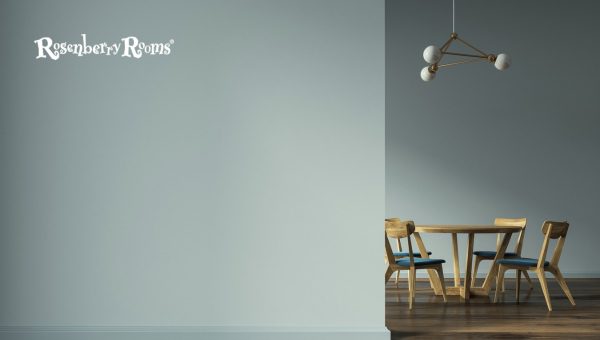
Classifying colors into "warm" and "cool" is a concept that transcends the boundaries of painting and interior design, reaching into our emotional perceptions.
Warm hues are often associated with excitement and energy, while cool tones exude calmness, serenity, and refinement.
Regarding Sherwin-Williams Comfort Gray 6205, you might question whether this versatile color falls within the realm of warm or cool tones. The answer?
Versatility is the lifeblood of Comfort Gray – it comfortably flirts between warm and cool spectrums.
We typically refer to hues with yellow, orange, or red undertones when discussing warm colors. They often bring to mind thoughts of sunlight and heat.
While Comfort Gray doesn't fall squarely into the category of warm colors, it can exhibit certain attributes under specific lighting conditions. For example, Comfort Gray may showcase warmer undertones in lower natural light settings.
Moreover, the decor and furnishings surrounding the shade can affect how the temperature of the color is perceived.
It might seem warmer if paired with warm-toned items and materials such as wooden furniture or yellow-based soft furnishings.
By contrast, cool colors are usually associated with blues, greens, and purples. Like an island beachscape or lush forest canopy, they often elicit peace and serenity.
Given that its name includes "gray" — often connected with cooler tones — you may be inclined to think that Comfort Gray falls into this range. And indeed, it does.
This exquisite shade primarily belongs to the cool spectrum. It's from the green color family—a traditionally cool range. This shade radiates cooler undertones under ample natural light or specific artificial conditions.
Yet its beauty also lies in its adaptability - despite being fundamentally a cooler hue, it harmoniously blends with different styles and aesthetics by projecting some warmth when required. A trait not many colors can boast!
Selecting a complementary paint shade with Sherwin Williams Comfort Gray 6205 could be the missing puzzle piece that combines your overall room aesthetic. Here are some options:
Combining Comfort Gray with compatible hues can manifest exciting color stories within your space, producing visual intrigue and establishing a delightful conversation between colors.
It's crucial to consider the final look you hope to achieve when selecting companion shades for Sherwin Williams Comfort Grey 6205.
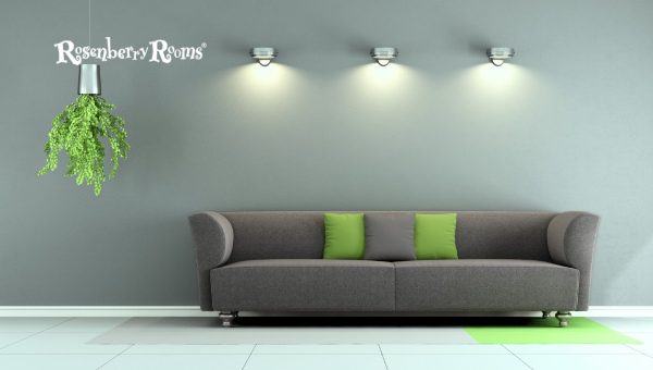
Sherwin Williams Comfort Gray lives up to its name by bringing serene comfort into your interior spaces. Versatile, chic, and soothing, this shade brings about a calming vibe and visual appeal to various spaces.
Comfort Gray brightens up all with equal charisma, whether it's your bedroom's personal sanctuary, the dining room's social setting, or the usually compact area specific for work (like a home office). Let's dig deep into exploring these spaces.
Your bedroom is more than just a place to crash at the end of every day; it's a haven where you should feel truly rested. With Comfort Gray 6205 on your walls, achieving this sense of relaxation and retreat is easy.
The cool undertones of this greenish-grey color promote calmness and peace — two crucial elements needed in any sleep-inducing environment. And its daylight reflection helps keep naturally lit bedrooms light and fresh.
Moving on to the dining room, where meals are shared, laughter is exchanged, and memories are made. What better way to emphasize these precious moments than through a comforting backdrop?
Comfort Gray shines in such settings; its blend of green-blue hues complements different styles and types of furniture marvelously — from modern metallic chairs to traditional wooden tables without being overly dominating.
For a home office, you need a shade that encourages focus while providing relaxation during those intense work hours.
Comfort Gray accomplishes just that! It offers neutrality, allowing for minimalistic visual distraction while promoting a calming environment conducive to productive work.
Comfort Gray 6205 meets all prerequisites for beauty— it wonderfully settles into indoor spaces while enhancing its charm with its soothing palette!
When choosing trim colors to accompany Sherwin Williams Comfort Gray 6205, consider the simple elegance of perfectly contrasting whites.
The correct trim color accentuates the main shade's beauty, giving your spaces a polished finish.
The best way to decide which trim complements your main wall shade is by taking home some sample pots or color chips – this way, you can see how they blend together in your home's lighting conditions!
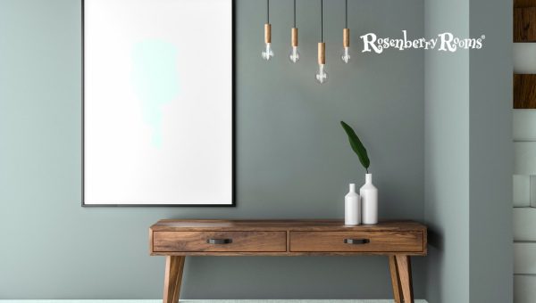
When studying the palette of colors similar to Comfort Gray, one color stands out - the enticing Benjamin Moore's Gray Wisp 1570.
The Gray Wisp shares an exciting resemblance with Comfort Gray. It belongs to the grey-blue color family, with a cool undertone making this shade feel calming and soothing.
Whether adorning a spacious living room or a home office, Benjamin Moore's Gray Wisp can effortlessly transform any space into a subtle, sophisticated sanctuary.
If you're looking for a slight deviation from Comfort Gray without losing the fundamental essence of its charm, this might be the right choice!
However, always remember, while opting for paint shades similar to Comfort Gray, such as Gray Wisp, you must consider factors like natural light exposure, adjacent colors in your space, and overall decor style.
Explore More: Sherwin Williams Jogging Path 7638 [Paint Color Review 2025]
A beautiful hue like Sherwin-Williams Comfort Gray 6205 is highly receptive to different lights, enhancing its unique charm.
However, light's effect on paint color varies with the room's orientation. Let's explore how this lovely shade plays out in rooms facing different cardinal directions.
North-facing rooms are known for their cool and somewhat dim lighting. The soft light they receive can potentially accentuate Comfort Gray's blue undertones, offering a tranquil ambiance.
This gray could be an excellent choice to counterbalance the somewhat cooler natural lighting these areas tend to have.
Southern exposure invites warm, intense light throughout much of the day. With Comfort Gray on your walls, south-facing rooms will look exceptionally inviting.
The more robust daylight can highlight the green undertones in Comfort Gray, giving it a warmer feel that seamlessly harmonizes with the brighter lighting conditions.
As east-facing rooms primarily get warmer morning sunlight and cooler light during the afternoon/ evening, Sherwin-Williams Comfort Gray can also be a stunning fit here.
When bathed in cool afternoon light, you might notice more of its calming blue undertones—making it an ideal shade if you're aiming for a relaxed aesthetic.
Westward exposures flood rooms with warmer, intense evening sunlight and cooler mid-morning/afternoon light.
Comfort Gray can beautifully elevate space for west-facing rooms by adapting throughout the day. It showcases its warm green hues during sunsets and poignant blue undertones when awash with morning or afternoon coolness.
It doesn't matter whether you want to inject warmth into your north-facing bedroom or hope to enhance your south-faced kitchen's relaxed atmosphere; Sherwin Williams’ Comfort Gray could be your answer!
It gracefully adapts itself, maturing into different shades based on cardinal directions—an attribute that underscores its allure and timeless versatility.
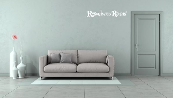
Sampling your paint color before committing to a full-scale application allows you to examine how the color interacts with surroundings, furniture, and light patterns at different times of the day.
By taking this small extra step with Comfort Gray 6205 or any other color choice, you'll be sure that you're making the right decision for your dream home.
Taking this precaution will allow you to visualize how the final result will look piece by piece – trust me, it's worth it.
Comfort Gray 6205 offers an elegant, subtle grey hue with slight undertones of green and blue.
Comfort Gray 6205 boasts a calming effect, creating a comfortable and serene atmosphere in living spaces.
With its medium-high LRV (Light Reflective Value), it's great for large and small interior areas, as it can maximize the available light.
The versatility of this shade means it fits seamlessly into various decor styles, from modern minimalist to classic traditional aesthetics.
Comfort Gray offers exceptional durability and stain resistance when used with the appropriate primer/base coat, as with all Sherwin-Williams paints.
Sherwin Williams Comfort Gray 6205 is a beautifully complex and versatile color choice. This soft, muted shade's ability to adapt to interior and exterior spaces, varied lighting conditions, and contrasting color palettes set it apart from many other paint options.
So, if you're considering a makeover for your home or simply looking to add a refreshing change, don't hesitate to sample this warm yet elegantly cool shade.
Comfort Gray 6205 could be the key that elevates your living space's look while mirroring the comfort and peace that makes a house feel like home.