So, you're searching for the perfect shade of paint and have stumbled upon Sherwin Williams Silverplate SW 7649. It's a color that's been getting a lot of buzz recently, and you're strongly considering it for your next project.
Well, you're in luck! We've compiled a comprehensive Sherwin Williams Silverplate SW 7649 color review that covers all bases — from how it looks under different lighting conditions to the emotional response it might evoke.
It's time to break down everything there is to know about this intriguing color and see if it fits your style and vision.
Whether you're considering using this color inside or outdoors, we've got you covered with great insights from homeowners who’ve walked this path before.
We'll reveal all the essential information so that you can make an informed decision tailored to your specific needs and preferences. So, sit back, relax, and prepare for a deep dive into the world of Silverplate.
Contents
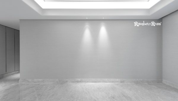
Sherwin Williams Silverplate color, tagged SW 7649, belongs to the "Living Well" color collection. It pairs beautifully with both interior and exterior spaces because of its versatility. The RGB values for this classic hue are R:194, G:192 B:186, while its hex value is represented as #c2c0ba.
With a light reflective value (LRV) of 53, it's bright enough to lift a room without overwhelming or stealing attention from other elements. The LRV indicates the percentage of light a paint color reflects - and in this case, Silverplate does so quite efficiently.
Located right in the heart of Sherwin Williams' vast color spectrum at location number 239-C5, this timeless shade provides an elegant backdrop for any style or theme you wish to showcase.
Just remember - paint colors can look different depending on their surroundings. Always test them in your actual living spaces before making your final decisions!
Sherwin Williams Silverplate SW 7649 has a Light Reflectance Value of 53. LRV refers to the percentage of light a paint color reflects.
On a scale of 0 to 100, 0 means it absorbs all light and appears black, while 100 reflects all light and appears white.
A color with an LRV of 53 somewhere in the middle, where it reflects more than half the light. This makes Silverplate, with its mid-way LRV score, an ideal versatile color that isn't too bright or dark. It can work well in various spaces, contributing to its popularity within Sherwin Williams' shades.
Sherwin Williams Silverplate SW 7649 is categorized as a slightly cool paint color. Unlike warm colors with undertones of red, orange, and yellow, this paint leans more towards a cooler hue due to its predominantly gray composition.
When applied, it complements spaces by giving a sophisticated and modern edge. Silverplate possesses blue undertones, which contribute to its cool quality.
It maintains a balanced neutrality,, allowing it to be versatile in various lighting conditions and décor styles.
The color in rooms with less natural light might appear slightly cooler, while rooms with abundant light might bring out a bit of warmth, making it an excellent choice for interiors.
Also Read: Sherwin Williams Pediment SW 7634 [Paint Color Review 2025]
Sherwin Williams Silverplate SW 7649 is a timeless, versatile shade with a mild blue undertone. While appearing mainly as a neutral grey in most lighting conditions, closer inspection reveals these subtle cool leanings.
This blue undertone helps the color to feel refreshing and modern without being overtly cold or stark. It works harmoniously alongside other hues, making it a beautiful choice for any space.
Remember that the perception of the color can be influenced by natural lighting or artificial light within a room, so always test a swatch before making your final decision.
These undertones give Silverplate its unique appearance - they provide an incredible depth to the hue, which otherwise might seem like an ordinary grey color.
These undertones contribute to Silverplate's versatility, making it suitable for various spaces and lighting conditions.
They also influence the other colors you may want to pair with Silverplate in your design scheme - cooler tones will generally work better as they complement the undertones in this paint color.
Incorporating Sherwin Williams Silverplate SW 7649 into your interiors can transform the overall ambiance of your home.
Its light and versatile nature make it an ideal base color for various rooms. Every room tells a different story; with Silverplate, you'll create a canvas that allows all those stories to flourish. Let's explore how this shade works in four key areas.
The entryway is your home's first impression, so why not make it stunning? You'll create a welcoming space that exudes sophistication and elegance by employing Silverplate in your foyer.
Its light-reflecting properties brighten the area while maintaining a sense of calmness, perfect for guests entering your abode. Complement this with dark wooden furniture or metallic accents for an appealing contrast.
When it comes to living spaces, comfort is essential. And Silverplate does just that! Its light and breezy undertones set a peaceful tone for relaxation and conversation.
This shade works particularly well in living rooms with large windows that allow lots of natural light to pour in, reflecting off the walls and brightening the space even more.
Pair it with greys or whites for a monochromatic color scheme, or add bright colors for visual interest.
Silverplate brings an airy feel to bathrooms, making them look clean and fresh. It pairs well with white tiles or fixtures for a crisp look.
Alternatively, dark-colored accessories stand out against this backdrop if you want more character. For smaller bathrooms without windows, applying Silverplate could help imitate the effect of natural light and make the space feel less claustrophobic.
Isn’t it nice to retire to a serene sanctuary at the end of each day? Application of Sherwin Williams Silverplate SW 7649 can turn your bedroom into just that tranquil haven!
Its subtly cool undertone induces calmness conducive to relaxation and sleep while adding visual spaciousness if matched with lights colored furnishings like whites or pastels.
Whatever room you choose to use Sherwin Williams Silverplate SW 7649 in, testing samples under different lighting conditions is key before making your final decision.
Incorporate this flexible hue into your interior design vision today - we promise you won't be disappointed!

Silverplate SW 7649 isn’t just for interiors! It can transform your home's exterior image from 'meh' to 'masterpiece.'
Its understated elegance and tranquil vibe make it an incredibly versatile choice, regardless of your home’s architectural style.
When looking to enliven the façade with interesting accents, Sherwin Williams Silverplate SW 7649 should top your list. The striking yet subtle hue coordinates well with natural stone, wood, or metal accents.
It does an incredible job of highlighting and enhancing other colors and materials used around the exterior without overpowering them.
Splashing Silverplate on your front door can give a modern and welcoming feel to your homestead immediately.
By keeping the surrounding trims and walls in contrasting bold or neutral shades, Silverplate works effectively as a statement piece to lead visitors inside.
Silverplate provides a soft touch when used on trim work against darker main exterior colors. This classic gray subtly frames windows and doorways without stealing the show or creating harsh contrast.
Using Sherwin Williams Silverplate SW 7649 on shutters can add character to any house facade that coordinates nicely with numerous siding colors.
This shade is particularly appealing if you want shutters that complement rather than contrast with your exterior color scheme.
Silverplate wears well on larger surfaces like walls, too. Whether siding or stucco, this elegant gray can bring out the best in material textures while creating a calming atmosphere for an inviting curb appeal.
As always, remember - nothing could be better than purchasing a paint sample before locking in any decisions.
You'll see how Silverplate appears during different times of day under varying environmental conditions and lighting situations around your home's unique location.
Read More: Sherwin Williams Amazing Gray SW 7044 [Color Review 2025]
Choosing the perfect paint color involves more than picking a shade you love. It's also about understanding how light affects that color.
Specifically, the direction of natural light your room receives — be it from the north, south, east, or west — plays a crucial role in how Silverplate SW 7649 will truly look on your walls.
Rooms with windows facing north often get less sunlight and can have a cool and shadowy feel. Silverplate takes on a slightly deeper tone in these spaces due to lower light exposure levels.
The cool ambiance accentuates the understated gray tones hidden within this hue. However, Silverplate still maintains its chic appearance and adds depth to your space even in this cooler light with decreased brightness.
On the other hand, if your room faces south, it presumably receives ample sunshine during the day. Under this brighter lighting condition, Silverplate radiates a warmer glow while still maintaining its primary grayish tone.
This makes it ideal for daytime spaces like sunrooms or cozy kitchen nooks where you'd want to maintain a certain brightness level.
Morning rooms that face east and bask in early daylight might cause Silverplate to lean towards cooler gray tones. The soft morning light gives it a sleek and contemporary feel - perfect for waking up to a calm yet soulful vibe.
As we progress through the day into rooms facing west, we see a transformation in color. Afternoon sunlight streaming from the west can draw out warm undertones from Silverplate - giving it an almost creamy finish by dusk hours.
Sherwin Williams’ Silverplate SW 7649 is truly versatile - changing subtly throughout the day depending on sun orientation and adapting beautifully under artificial lights as well.
Understanding these nuances ensures that when you commit to this elegant shade of paint, you know exactly how it will elevate your space under every lighting circumstance.

When embarking on any painting project, conducting sample runs is crucial. Even though Silverplate SW 7649 might look perfect on the color swatch, its appearance can dramatically change once applied to your walls.
Natural light exposure, artificial lighting, room size, and surrounding colors alter the final look.
So, how do you conduct a sample run? Simple. Purchase a small sample of Silverplate SW 7649 from Sherwin Williams and apply it on different walls of your desired space. Observe how it reacts to light throughout the day and in artificial light at night.
This step can save you from investing time and money into a color that doesn't turn out as expected. A paint’s interaction with your space's unique features can make or break its appearance, so it's always worth testing before plunging into full-scale painting.

Finding the right trim color is crucial in enhancing the beauty of Silverplate SW 7649. An expertly matched trim can distinguish between a good and great paint job. Let's explore the top three Sherwin-Williams colors that work brilliantly with Silverplate.
These are just suggestions, but remember, each room has unique dynamics, including lighting conditions and color schemes that can impact how different shades interact.
Conduct a trial run before finalizing any decisions; start small with sample sizes or digitally visualize them in your space through Sherwin Williams' online visualizer tool.
With that said, mastering the art of complementing colors will allow you to create harmonious contrasts in any room you choose.
These palette choices offer enough balance and interest without feeling jarring or out of sync with Silverplate SW 7649.
Also Read: Sherwin Williams Tradewind SW 6218 [Paint Color Review 2025]
Silverplate is versatile - it can work well in living rooms, bedrooms, kitchens, or exteriors for a sophisticated look.
While Silverplate does have a neutral base, it leans slightly towards the cooler side mainly because of its subtle gray undertones.
Neutral colors such as white and soft blues complement Silverplate beautifully. Darker shades like Cityscape SW 7067 also create an interesting contrast.
Yes, like most colors, the appearance of Silverplate can change under different lighting conditions. It's best to test it under various lights before finalizing.
Definitely! Due to its somewhat cool and sophisticated vibe, it easily suits both modern and traditional exteriors – from sideings to front doors.
Sherwin Williams Silverplate SW 7649 is a versatile and sophisticated choice for interiors and exteriors. It falls on the cooler side of the spectrum, offering a neutral base that provides an elegant backdrop to a range of color schemes.
Whether planning a full renovation or just a fresh coat of paint, this hue can grant your space an elevated and stylish look.
Remember that lighting conditions can significantly affect how this color appears in your space. Always opt for a sample test before ensuring it fits perfectly with your design vision.